
Sunday, February 27, 2011

Thursday, February 24, 2011

Tuesday, February 15, 2011


Monday, February 14, 2011


Print | Editorial book/zine | - Layout & Design Style
After careful thought and consideration, I have decided to complete a book/zine as a major section of the FMP. It will consist of 20 pages (incl. front & back), and a total of 7 double page spreads on the different interviewees that experienced the 'Dark Ages'. Each double page spread will have it's own designed Typeface for the heading, to describe the character and emotions felt by that person.
As the time period of the 'Dark Ages' was during the 60s (1963 - 1974), the design style would be from that period. A 1960s psychedelia, but bursting from darkness. Each page will have their own dark hidden meaning, garnished with bright colours to give light to each interviewee.
Picking the colours from each image I was able to get a colour scheme that was more success ful during that period.

 _Stills from the film "Gimme Shelter", documenting the Rolling Stones' Altamont concert, December 1969
 _Tin document storage box, with printed "flower power" design.
_Chosen mainly for the 'art nouveau' style, with the whiplash lines and stylised flower shapes, which were revived in the 1960s and metamorphosed into psychedelia. The colours during these periods were mostly vibrant, such as bright red and purples, where there was deliberate clash of colours, for example orange and pink.
 _Printed polyester dress, decorated with Art Nouveau ladies' heads. The 1960s updated the Art Nouveau style in bright, psychedelic colours.

As the time period of the 'Dark Ages' was during the 60s (1963 - 1974), the design style would be from that period. A 1960s psychedelia, but bursting from darkness. Each page will have their own dark hidden meaning, garnished with bright colours to give light to each interviewee.
Picking the colours from each image I was able to get a colour scheme that was more success ful during that period.

Image Analysis


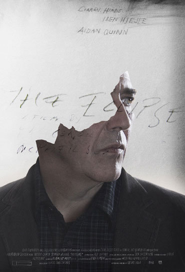
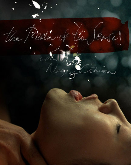
Worn down typography, where some letters have eroded off, gives a textured history, presenting itself to the audience that it has been through time, and it is there to be examined and analysed to get different versions of that it has been through.

_Chosen mainly for the 'art nouveau' style, with the whiplash lines and stylised flower shapes, which were revived in the 1960s and metamorphosed into psychedelia. The colours during these periods were mostly vibrant, such as bright red and purples, where there was deliberate clash of colours, for example orange and pink.

_The use of short words in large colourful letters is typical of Pop artist Robert Indiana. The "Love" poster is his most famous image, created for a Museum of Modern Art Christmas card in 1964 and then reused on a United States Postal Service stamp in 1973.
_Traffic signs, automatic amusement machines and commercial stencils inspired his early works and in the early 1960s he developed his style of vivid colour surfaces, involving letters, words and numbers. He was later known for silkscreen prints, posters and sculptures, in which had as their theme the word LOVE.
Tuesday, February 8, 2011
Saturday, February 5, 2011
MotionGraphics/Print • Inspiration
Onesize Reel 2010 from Onesize on Vimeo.
The techniques used within this video excite me, even the over lapping of geometric shapes to create another message, or masking the typography with photography that creates a hidden message within another.
This piece of print by Keller House, uses hand rendered typography over photography taken to communicate the senses and removed and replaced by either typography or geometric shapes.
Editorial/Book page _designs
 |


Contents page will set out as infographic layout. Different layouts in order to maximise the typed area which would highlight different areas of Northern Cyprus, where villagers escaped from, which will also include 'snapshots' of the interviewee's and any other photos that were taken during the time.
Friday, February 4, 2011
Change in outcome
After careful decision, the outcome has been changed in order to communicate the the correct information.
After the presentation; a confusion into what I wanted to communicate was not picked up upon. The question had to be asked, what would be the best way of communicating my source without sending out thewrong message and offending different demographics?
The outcomes will still be; print/motion/3D.


After the presentation; a confusion into what I wanted to communicate was not picked up upon. The question had to be asked, what would be the best way of communicating my source without sending out the
The outcomes will still be; print/motion/3D.
- Print_ will be a editorial zine that will communicate the events that took place of the innocent villagers that were running away from the 'Dark Ages'. The pages would illustrate the darkness that they had to hide in to get through their lives. Maybe in a Frank Miller style visual communication, but still legible visually and typographically. Each double page will hold a interview taken, with its own designed typographical heading. Another inspiring graphic design is Swiss-born graphic designer, Anouk Rehorek. Her book design - Identity Sucks! - is the first project of World Identity Lab, where the book communicates the teenagers life goals from all over the world, and asked why. Another editorial piece by Anouk Rehorek is - A Guide Magazine Issue 01 - a magazine that "builds on the quality and power of creativity, searching for mentors and proponents and transgressing current lifestyles." The main focus of the magazine is to highlight the historical and current success stories of creatives and companies which have grown through the different generations.


- Motion_This will involve vox pops of the interviewees juxtaposed with illustration and typography to communicate to the audience. By simplifying the different visual communication techniques, it allows the demographics to understand what i am trying to put across. Not too obvious, grungy, but also as though it is a hidden message displayed to try and prevent other observers from understanding.
- 3D_This is still in process. A way of communicating escaping, darkness, identity, surviving, stories.
Subscribe to:
Posts (Atom)